Choosing Your Portfolio Layout
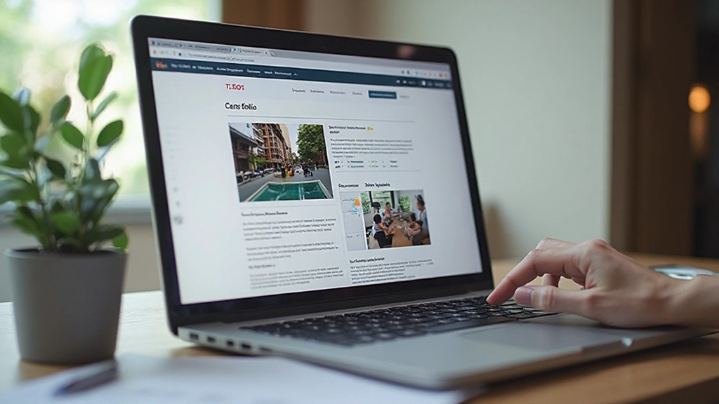
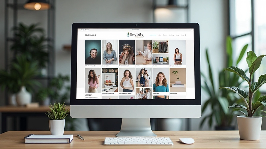
Three layout approaches and when each one works best. Covers grid-based, case studies-focused, and minimal approaches to organizing your projects.
Read GuideMost clients view portfolios on phones now. Here’s how to make sure yours looks great on every screen size.
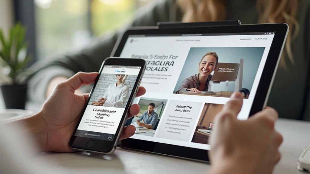
Here’s the reality: over 60% of portfolio views happen on mobile devices. That’s not a trend—it’s your new baseline. If your portfolio looks cramped, hard to navigate, or slow on a phone, potential clients are clicking away before they see your best work.
The good news? Building a mobile-first portfolio isn’t complicated. It’s actually simpler than the old approach of designing for desktop first and squeezing it onto phones. We’re going to walk you through exactly how to structure your portfolio so it feels native and natural on every device—from a 320px phone screen to a 1440px monitor.

Mobile-first design rests on three interconnected ideas. First, you’re designing for the smallest screen first—not as an afterthought. This forces you to prioritize ruthlessly. Every element needs to justify its existence. Navigation simplifies. Images serve a purpose.
On mobile, there’s no room for “nice to have.” Your featured projects come first. Your strongest work leads. Secondary navigation and about sections come after the portfolio itself. When you expand to tablet and desktop, you’re adding more breathing room—not reorganizing content.
Buttons need to be at least 44×44 pixels. Links can’t be tiny. Hover states don’t exist on phones, so you’re relying on active and focus states. Navigation menus work best as hamburger menus on mobile—it’s familiar to users and saves precious screen space.
Mobile connections are often slower than desktop. Your portfolio needs to load fast on 4G. That means optimized images, minimal JavaScript, and efficient CSS. A portfolio that takes 5 seconds to load on mobile will lose clients—no matter how beautiful it is.


Start with this foundation. Your portfolio needs a responsive grid system—and don’t overthink it. A simple approach works best: single column on mobile, two columns at 768px, three columns at 1024px.
Your project cards should be full-width on mobile with plenty of vertical padding. The image takes up all the space. When someone scrolls to see your project, they’re looking at a full-screen image first. That’s the power of mobile-first design—the strongest visual comes first.
These breakpoints are proven. They match how devices actually work. A typical smartphone is 375-390px wide. Tablets range from 768-820px. Desktops start around 1024px and go up from there. Building to these widths means your portfolio feels native on real devices.
Your hero image shouldn’t exceed 150KB on mobile. Use modern formats—WebP for browsers that support it, JPEG as fallback. Use srcset to serve different image sizes to different devices. A phone doesn’t need a 4000px-wide image. Neither does a tablet. You’ll cut load time in half.
Horizontal navigation menus don’t work on phones. Use a hamburger menu that collapses into a clean toggle button. When expanded, it should slide down from the top or slide in from the side. Keep it smooth and fast—no delays. Test it with your thumb, not your mouse.
Your headline shouldn’t be 48px on mobile and 72px on desktop. Use responsive typography that scales smoothly. CSS clamp() is perfect for this—it scales proportionally between your minimum and maximum sizes. Headings feel right on every device without sudden jumps between breakpoints.
Chrome DevTools is helpful, but it’s not a real phone. Get an actual smartphone. Test on Safari and Chrome. See how your portfolio looks in direct sunlight. Check if buttons are easy to tap. Real testing catches issues that emulators miss.

You don’t need to memorize metrics, but these targets keep your portfolio competitive on mobile networks.
Aim for under 3 seconds on 4G. This is the threshold where people stop waiting. Your portfolio should load fast enough that someone sees your hero image before they’ve even finished scrolling past the address bar.
Keep your homepage under 2MB. That sounds like a lot, but poorly optimized images blow past this easily. Every image you add is a decision—does it serve your portfolio’s goals? If not, remove it.
Use Google PageSpeed Insights. Aim for 85+. This free tool tells you exactly what’s slowing down your mobile site. It catches things you’d miss manually—unused CSS, unoptimized images, render-blocking scripts.
Every interactive element should be at least 44×44 pixels. That’s finger-sized. Your contact button shouldn’t require precision. Links shouldn’t be crammed together. Space them out.
Mobile-first isn’t just about making your portfolio fit smaller screens. It’s about recognizing where your clients actually are—looking at your work on their phones during coffee breaks, scrolling between projects at their desks on tablets, and reviewing final details on their monitors at home.
When you design mobile-first, you’re forced to make smarter decisions. Every element earns its place. Your strongest work leads. Your portfolio loads fast. And when someone lands on your site from Instagram or LinkedIn on their phone, they see exactly what you want them to see—without the friction of zooming, scrolling horizontally, or waiting for things to load.
Start with a phone-sized mockup. Build your HTML mobile-first. Add CSS media queries for larger screens. Test on real devices. The result? A portfolio that works everywhere—and actually gets you the clients you deserve.

This article provides educational information about portfolio design practices. While the principles and recommendations shared are based on established web design standards, results depend on your specific situation, audience, and implementation. Different projects may require different approaches. Consider consulting with experienced designers for portfolio-specific guidance tailored to your unique needs and goals.