Visual Consistency Across Your Portfolio
A cohesive visual identity separates professional portfolios from scattered ones. We’ll explore how typography, color systems, and spacing choices create a unified brand experience that impresses clients.
Why Consistency Matters More Than You Think
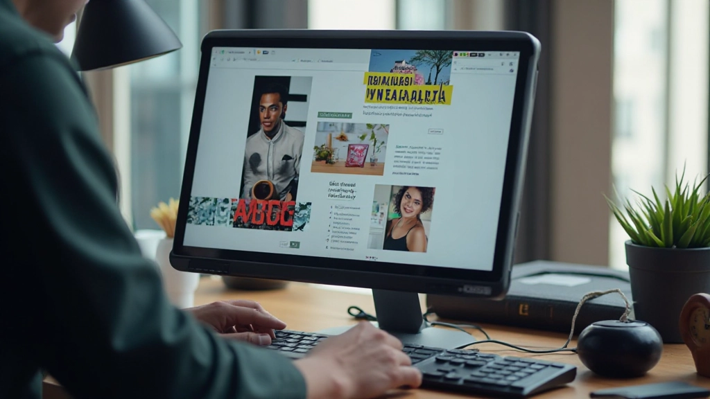
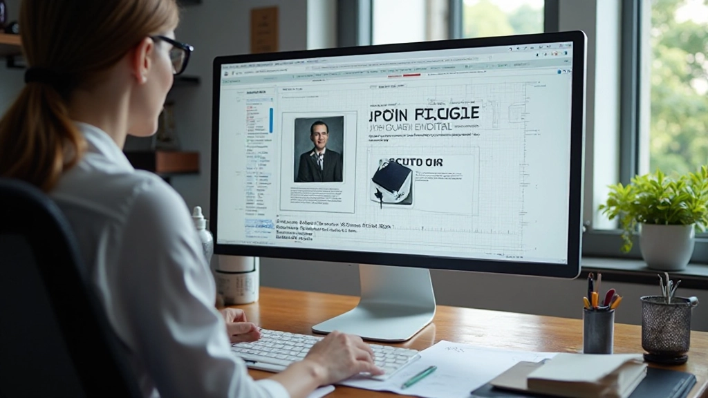
When clients land on your portfolio, they’re not just evaluating individual projects. They’re assessing whether you’re someone who sweats the details. Inconsistent fonts, misaligned spacing, or color palettes that shift between pages signal carelessness—even if your design work is excellent.
Visual consistency builds trust. It shows you understand fundamental design principles and apply them consistently. More importantly, it creates a memorable brand identity that clients associate with your work. Think of it like walking into a designer’s office: everything from the furniture to the typography reflects their aesthetic. Your portfolio should do the same.
Three Pillars of Visual Consistency
- Typography: 2-3 font families maximum, consistent sizing scales
- Color System: Limited palette (5-7 colors), predictable usage
- Spacing & Layout: Grid-based design, uniform margins and padding
Typography: The Foundation of Visual Hierarchy
Your font choices are the first thing clients notice. Most portfolios fail here by mixing too many typefaces or using inconsistent sizing. We recommend starting with a maximum of three fonts: one for headings, one for body text, and optionally one for accents.
Create a type scale—a mathematical system where each size builds on the last. For example: 12px (body) 16px 20px 28px 36px (headline). This creates visual harmony without feeling rigid. When you’re consistent with sizing across every project page, clients subconsciously feel that sense of order.
Line height matters too. Body text should sit around 1.6x the font size for comfortable reading. Headings can be tighter (1.2x). These small choices compound across your entire portfolio, creating a professional reading experience that generic layouts can’t match.

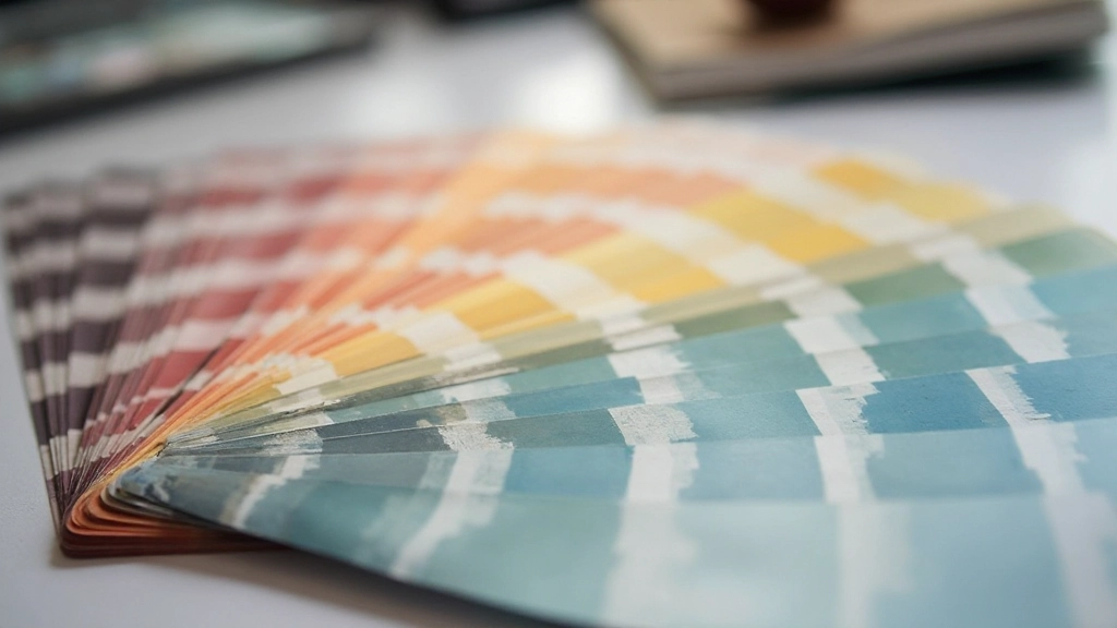
Building a Color System That Works
Your color palette doesn’t need to be complex. In fact, the best portfolios use surprisingly simple systems: a primary color (usually the brand color), 1-2 accent colors, and a range of grays for text and backgrounds. That’s it.
The key is predictable usage. If your primary color appears in your navigation, use it consistently in buttons, links, and hover states throughout the portfolio. Don’t suddenly switch to a different blue on page three. Your accent colors should reinforce specific actions—like a call-to-action button or a highlighted project.
Gray isn’t boring when used strategically. Establish at least three gray shades: one for backgrounds, one for borders, and one for secondary text. This creates depth without introducing new colors. Your clients will perceive your palette as intentional rather than random.
Spacing & Layout: The Invisible Grid
Consistency in spacing is what separates amateur portfolios from professional ones. You’ve likely heard of the 8-pixel grid system—where all spacing increments are multiples of 8 (8px, 16px, 24px, 32px, etc.). It’s not magic, but it creates visual rhythm that feels natural to the eye.
Apply this consistently everywhere: padding inside cards, margins between sections, gaps between grid items. When every measurement follows the same system, the entire portfolio feels cohesive. A project description with 16px padding looks intentionally designed rather than hastily thrown together.
Your layout should follow a consistent column structure too. Whether you’re using a 12-column grid or something simpler, stick with it across all pages. Project cards should align, text should sit on the same baseline, and images should respect margins uniformly. This isn’t about rigidity—it’s about creating predictability that builds trust.
Common Mistakes That Break Visual Consistency
Too Many Fonts
Using four or more typefaces creates visual chaos. Clients struggle to understand your hierarchy. Stick to a maximum of three fonts—one for headings, one for body, one for accents. That’s enough for any portfolio.
Inconsistent Button Styles
Buttons should look identical across your entire portfolio. If your “View Project” button is 14px on one page and 16px on another, it signals inconsistency. Define button styles once and reuse them everywhere.
Random Spacing
When spacing varies wildly between sections, your portfolio feels unprofessional. Use consistent margin and padding values throughout. If your project cards have 20px padding, use 20px (or multiples of your base unit) everywhere.
Shifting Color Palette
Don’t use different accent colors on different pages. If your primary color is teal on the home page, it should be teal throughout. Color consistency reinforces brand recognition and professionalism.
Misaligned Elements
Images, text, and components should align to an invisible grid. Misaligned elements—even by a few pixels—create a sloppy impression. Use CSS Grid or Flexbox with consistent gaps to maintain alignment.
Varying Image Aspect Ratios
If project thumbnails are different sizes and aspect ratios, your portfolio looks chaotic. Enforce a consistent aspect ratio (like 16:9 or 3:2) for all project images. Consistency here makes a huge visual difference.
How to Implement Consistency in Your Own Portfolio
Start with a design system document. It doesn’t need to be fancy—a simple Google Doc or Figma file listing your typography rules, color codes, spacing scale, and component styles works perfectly. Include:
- Font names and sizes for headings, body, and accents
- Hex codes for every color in your palette
- Spacing increments (8px, 16px, 24px, etc.)
- Button styles, hover states, and spacing
- Image aspect ratios and sizes for different contexts
- Border radius values (if you use rounded corners)
Then, build reusable CSS classes for every element. When you create a new project page, you’re simply applying these predefined classes rather than making design decisions on the fly. This approach scales beautifully as your portfolio grows.

“Visual consistency isn’t about being rigid or boring. It’s about making intentional choices and committing to them. When every detail reinforces your design philosophy, clients see a designer who understands their craft.”
— A principle every portfolio should embody
Creating Your Consistent Visual Identity
Building visual consistency isn’t complicated. It’s really about making a few solid design decisions and sticking with them. Choose your fonts, lock in your colors, establish your spacing system, and apply them uniformly across every page. That’s the formula.
When you walk into a gallery, you don’t question whether the frames on the wall are the same. You expect consistency. Your portfolio should feel the same way—like every element was carefully considered as part of a cohesive whole. This attention to detail is what separates portfolios that impress from ones that merely show work.
Ready to audit your portfolio for consistency? Start by documenting your current design choices. You might be surprised where you’ve drifted.


Disclaimer
This article provides educational information about portfolio design principles and visual consistency. While these guidelines are based on widely-accepted design practices, every portfolio and client is unique. Your specific design choices should reflect your individual brand, target audience, and industry standards. Design principles serve as guidance rather than absolute rules—the most important thing is understanding why you’re making each choice and whether it aligns with your professional goals.